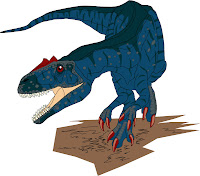
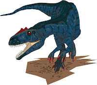
 Continuing on from where I left off last time, I've been painstakingly coloring in my Allosaurus line drawing using Adobe Illustrator. This is my first attempt at a dinosaur drawing with Illustrator. First of all, I just colored in the basic colors and added 'scutes' (?) and scales and what not.
 Then, I started adding in shades using black and light areas using white. I used black and white hoping that by making them transparent would have the effects of shading and hi-lighting. And it seemed to work. The beauty of this is that I now have a generic shade/lighting pattern that is consistent regardless of the undertone colors. But getting it right took a lot of time and loads of trial and errors...
 But then, I realised my Allosaurus looks too glossy and looks more like an amphibian or one of those old 1950's- 1960's reconstructions. So I added in a whole load of scaley patterns again with black and made them transparent. For simplicity, I just made a handful of little hexagons of assorted sizes with the polygon tool and copied and pasted the whole lot all over the animal. It kind of looks a bit grittier now, I hope...
Lastly, I resized the outline to a thinner line and got rid of excess lines. And this is how it looks. I'm quite surprised at how good it looks despite my total lack of experience in this whole thing...

Comments
Like the blue colour scheme too very sleak and killer-like.
When I compare the pencil drawing and the illustrator final, I suspect you'd generate more impressive results more efficiently within photoshop or painter. The details you allude to in the pencil version could be quickly strengthened with an appropriate pencil brush + layer effect.
Still, an impressive piece! Congratulations!
Ah, thanks for that. I'm pretty new to digitally enhancing my pencil sketches so I'm not yet fully aware of the capabilities of photoshop etc.